why we design in figma

Design, for us, is really about translation, taking something essential about who you are and giving it shape on screen. Every site we build starts from the same place: a commitment to treat your brand with care, and to make something clear, beautiful, and purposeful.
Figma is how we do that.
Not because everyone uses it (though most designers do), but because it gives us room to work with precision without feeling rigid. Our ideas can stretch out, then find their form.
prototypes that actually feel like your site
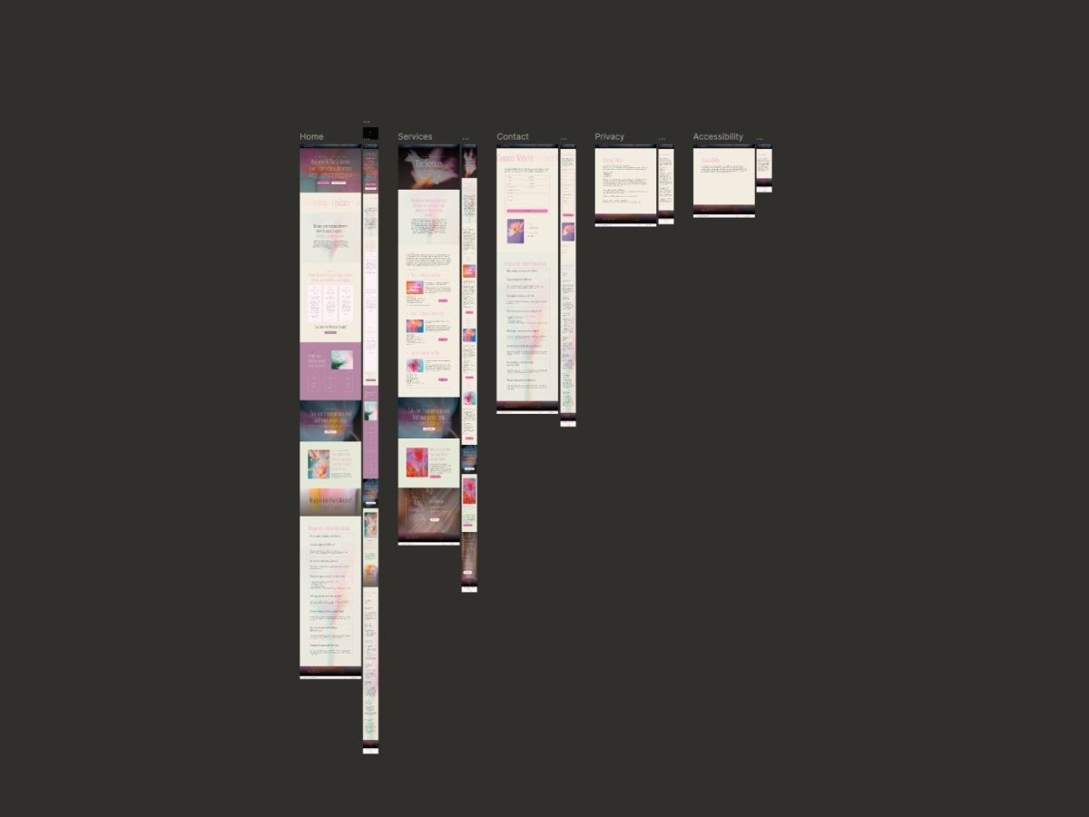
We don't hand over loose sketches or bare-bones wireframes. We build full visual worlds in Figma—where the type, the colors, the spacing, the rhythm all come together the way they will on your finished site.
Think of it as a bridge. Our developer can step into the design and see exactly what we intended. Nothing gets lost along the way.
What this means in practice:
- Development stays clean and consistent (and more efficient!)
- Your brand's subtleties actually make it through
- We build faster, with fewer back-and-forths
- The final site matches the vision
When you're building something that withstands, that kind of clarity really matters.
keeping your brand whole
A brand isn't just colors and fonts—it's a feeling, a through-line, a personality. We use Figma to protect that across every page of your site.
We build libraries: your exact colors, your typography, your buttons and components. Everything lives in one place, speaking the same visual language. So whether someone lands on your homepage or a deep interior page, the experience feels like you.
These systems work quietly in the background, keeping the rhythm and harmony intact from screen to screen. The whole thing feels cohesive, not because we forced it, but because we built it that way from the start.
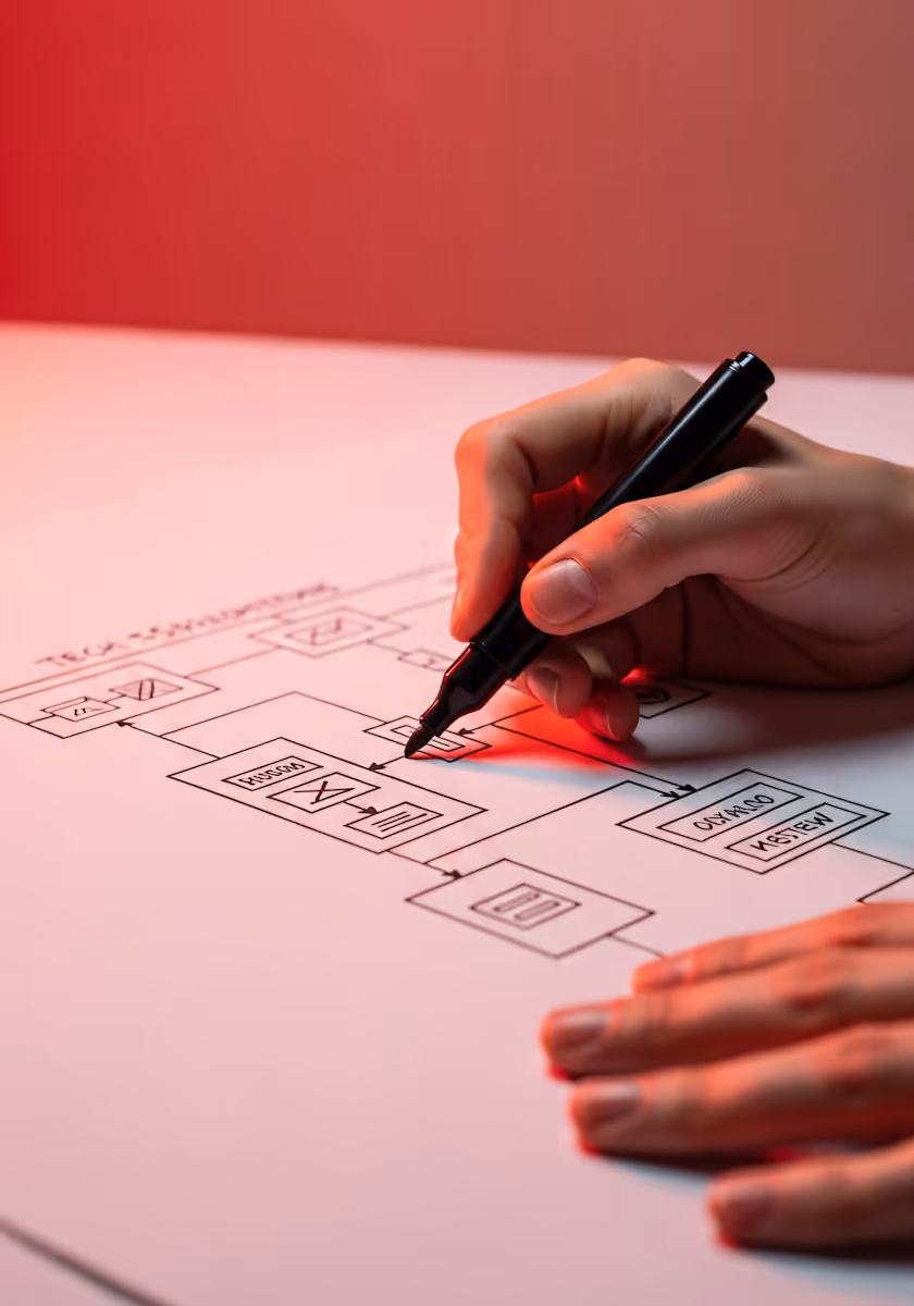
getting from design to code (without the headaches)
We don't use Figma to simply present ideas to clients (though of course we do that too!) we use it to make the build go smoothly.
Our developer can open the file and see everything: exact spacing, precise colors, how things should behave. The site gets built accurately, without a lot of guesswork or re-dos. Fewer errors. Faster timelines. More energy left for the work that actually matters. Like the unique details we add to each and every site.
A few things that help this happen:
- Components we build once and use intentionally throughout (which also speeds up your site!)
- Layouts that flex and respond naturally
- Clear naming, tidy layers (which Google loves!)
- Spacing that protects the breathing room in your design
- Files organized for clarity, not chaos
The result is a smoother path from what we imagined together to what actually goes live.

how a project moves through figma
Our process is gentle and considered, like everything else we do:
1. Foundation We start with a small design system tailored to your brand—colors, type, spacing. The quiet architecture underneath everything.
2. Wireframes Simple layouts to figure out hierarchy and flow. Nothing fancy, just functional.
3. Full Design This is where your brand finds its digital home. Nuanced, expressive, complete.
4. Prototype A polished, working preview that feels like your real site.
5. Handoff A clean, organized file our developer can run with—so the build honors everything we designed.
If you're drawn to a website made with care, something clear and quiet and intentional, we'd love to make it with you. Whenever you're ready, our inquiry form is ready for you. A small first step toward something good.